 I just received Johanna and Jack's wedding album from Leather Craftsmen, and it's gorgeous! Check it out:
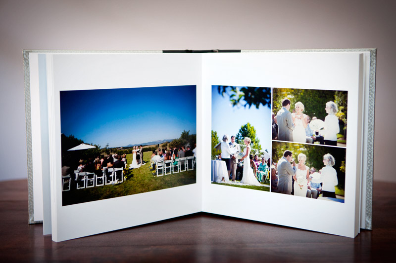

 I just received Johanna and Jack's wedding album from Leather Craftsmen, and it's gorgeous! Check it out:


 When we hand off the final delivery of wedding images to our clients, we literally give them hundreds of photos - often times close to 1000. What on earth is one supposed to do with all of these pictures??? One of my brides (and cousin!) from last year, Yen Yen and her husband Davin, kindly allowed me to photograph what they've done with their wedding pictures. Their photos are decorating their living room wall, and I think they look bright, festive and beautiful! I also really like the way Yen Yen included her invitation in the wedding set. Now, wouldn't coming home to a wall of photos from one of the happiest days of your life always put a smile on your face?


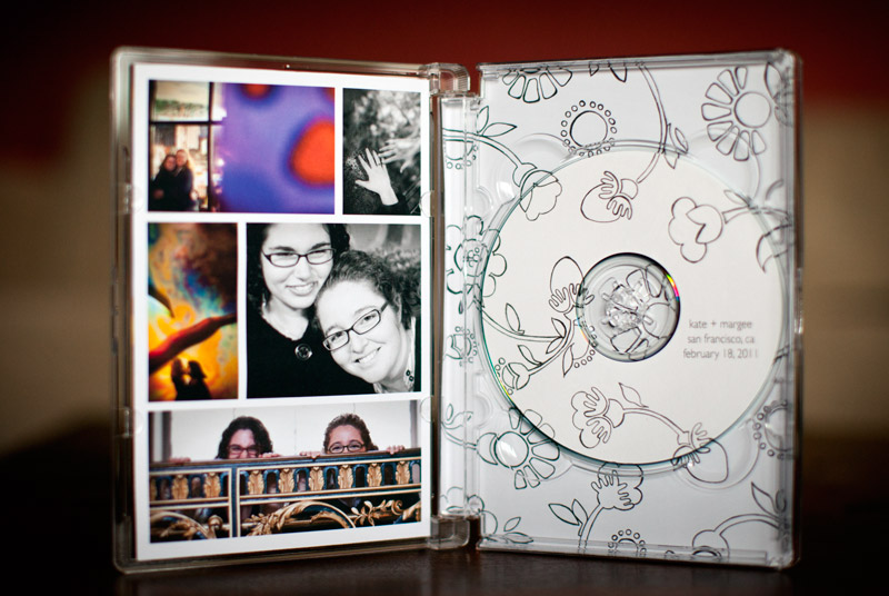
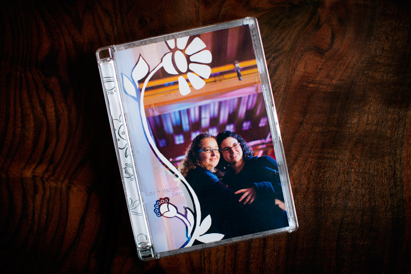 Remember how I shared pretty much all of my collateral the other week during our "Identity Series?" The only missing piece was my DVD case, and with Margee and Kate's recent engagement shoot, I got the opportunity to finally implement our new design! So, here it is. I love the way the flower frames the cover photo. I printed everything at home, using templates and cases from Jewelboxing.
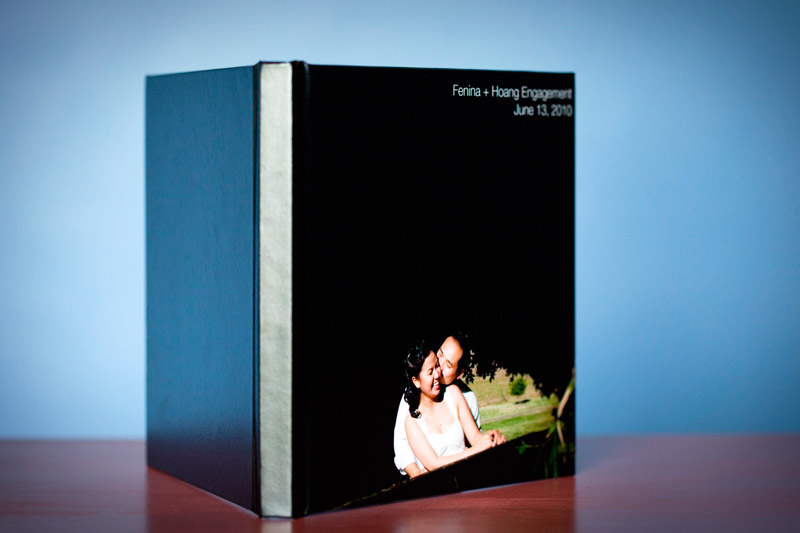 Adm and I love doing engagement sessions with our couples. Not only do we all get a chance to get to know one another, which helps make things more comfortable at the wedding, but we also look at them as opportunities for us to really push ourselves creatively and experiment with different techniques, compositions, poses and lighting styles. When we're photographing weddings, we pretty much try to stay as discreet as possible, with the exception of the portrait sessions. And, during the portrait sessions, we try to move as quickly as possible so that our couples can spend time partying with their family and friends. Trust me, no bride or groom wants to hang around taking photos with us for hours while their guests who have flown thousands of miles to see them are enjoying their food and drinks on their dime. So, in contrast to the quick pace of weddings, engagement sessions are a whole other story. We don't limit ourselves time-wise (although we're sensitive to the fact that most of our couples are not professional models and taking pictures can be exhausting) so we are really able to work each shot until it comes out just right. We also love exploring different locations, encourage the use of meaningful props and are all about the outfit changes. Lord knows how many times I change my clothes before going out of the house. Right, Adm?
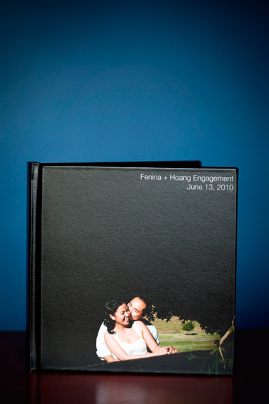
At any rate, what comes out of these sessions is a fairly substantial yield of beautiful photos. We usually provide anywhere from 125-150 images, with about one third of the photos in black and white, and the rest in color. You may be thinking, "What on earth do people do with all of those pictures?" Well, I'll tackle that question more thoroughly in a later blog post, but for now, I'm happy to introduce that we have added an engagement guest signature book as one option for displaying a large selection of all of your engagement photos!
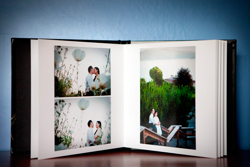
Our guest signature book allows guests to see all of your beautiful pictures as well leave a sweet and congratulatory note that you'll cherish as part of your wedding day memories. Oh yeah, and signing the book will give them an activity so that they may just leave you one cocktail and an appetizer while you're having your picture taken.
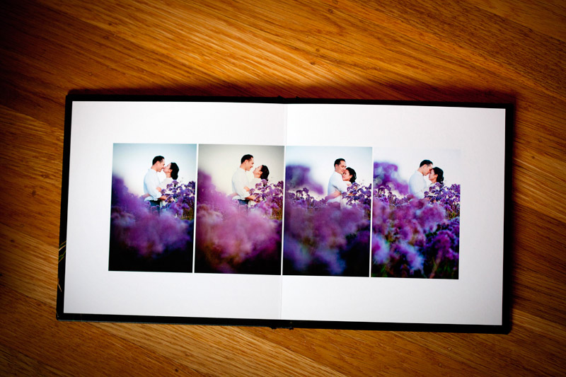
The page layouts are designed to leave plenty of white space around the edges which gives guests places to sign.
 How many times do you receive business cards and put them in your pocket only to find them crumpled and completely chewed up in the washing machine? Well, that's happened to me so many times I've lost count. I am notorious for forgetting to empty my pockets before doing laundry. So, then, what's the point of spending money for nice business cards, you may ask? Well, I wondered that same thing, and here's what I've come up with: my goal of giving someone a business card is to leave an impression with them. I want them to remember that card that's in their pocket and go check out the information that's on the business card, i.e., pull up my web site next time they're on the computer. I'm not leaving stacks of cards at coffee shops hoping that random people will pick them up. I'm selectively giving cards out to prospective clients, other wedding vendors and hopefully wedding bloggers and editors. This means that I need my card to stand out, not only to encourage people to remember it and use it, but also because it's often other people's first impression of my style and aesthetic, and we all know how important first impressions are.
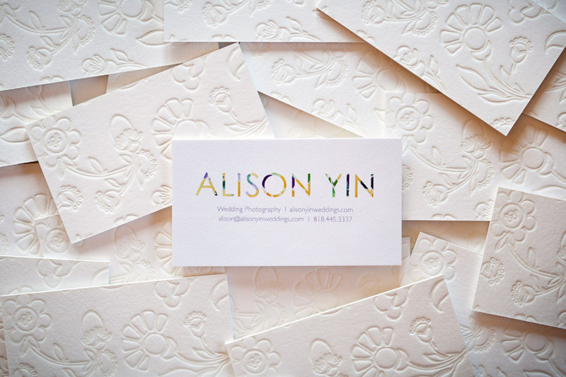
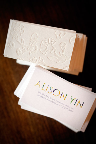
Therefore, Emma and I decided to make a card so thick there's no way someone will forget about it in their pocket. I also read that the more texture your card has, the more of an impression (literally and figuratively) it will make on someone just because they end up touching it more. So, here they are. They were created by Twig and Fig in Berkeley. The back of the card is letterpress with Emma's hand sketched floral illustration, and the front is flat color printed, all on recycled paper stock with soy based inks. Check 'em out:
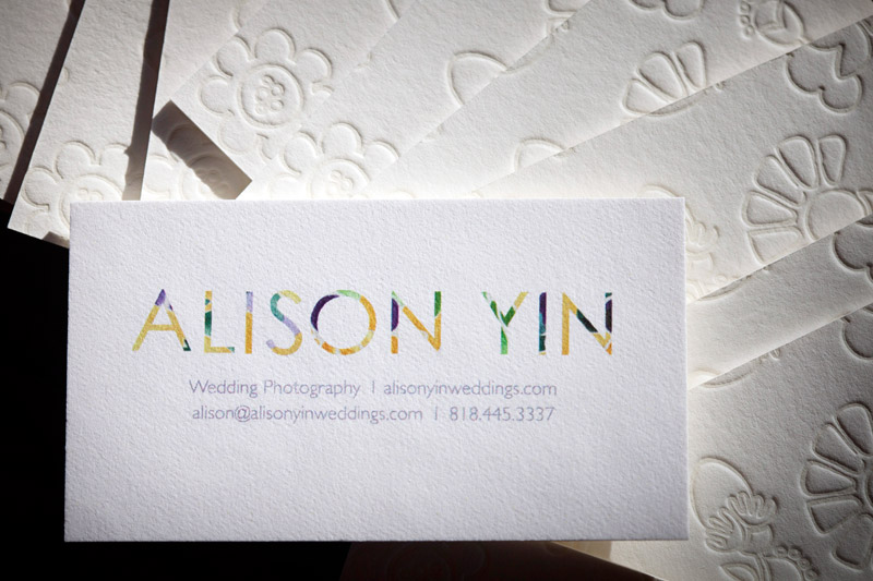

I know I went a little overboard with all the photos, but they are really beautiful, and since most of you can't see them in person, I figured I'd overload you with images. : )
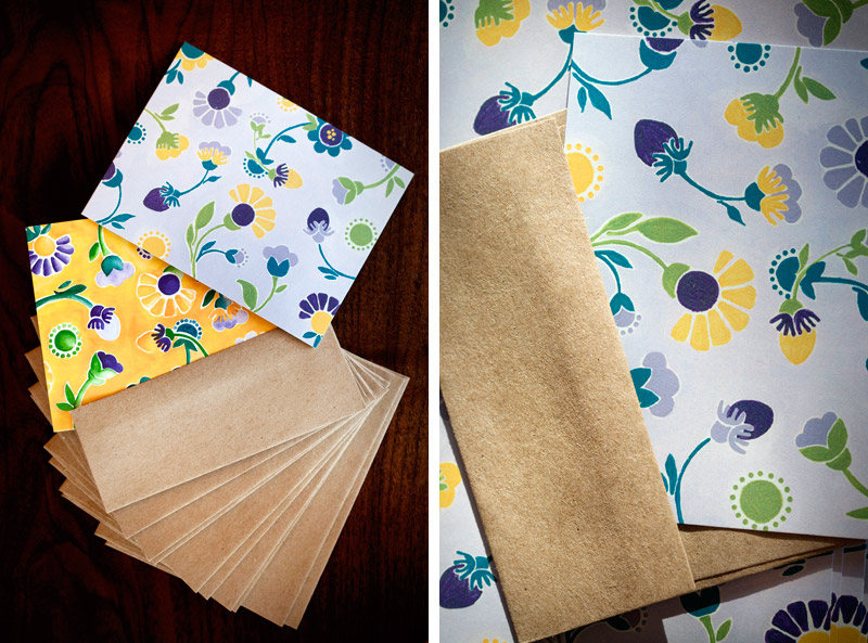
Stationery is up next. I send out handwritten cards to clients and other wedding vendors. Since Emma had created such lovely paintings - the purple one is acrylic and the yellow is watercolor, it was pretty easy to use both as the fronts of my cards. We used the purple painting for flat cards and the yellow painting for folded cards. The cards were printed by Brandes Printing Company, also in Berkeley, and also printed on all recycled paper stock with soy-based inks. I picked up the envelopes from Xpedex Paper Store in Berkeley, and again, they're 100% recycled - do you see a trend here?

Here are the mailing labels that Emma designed. The smaller ones are for the stationery cards - they fold over so that my return address is on the back (Emma is so clever!), and the larger labels are for boxes that I send out. I actually printed these at home on sticker paper and then cut them out. Hooray for DIY!

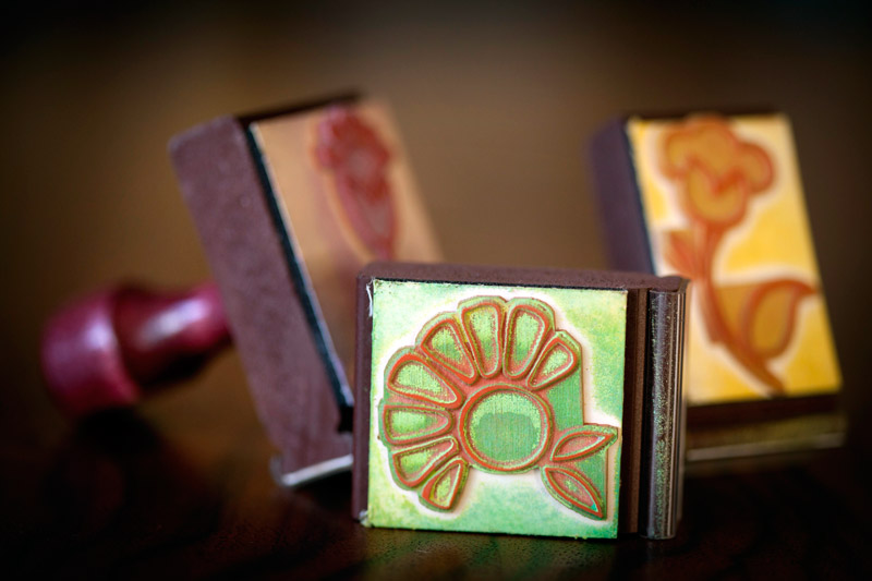
Emma made some stamps for me. You can never have too many stamps, right? I'll use them for all different things - envelopes, labels, boxes, hang tags... there are endless possibilities!
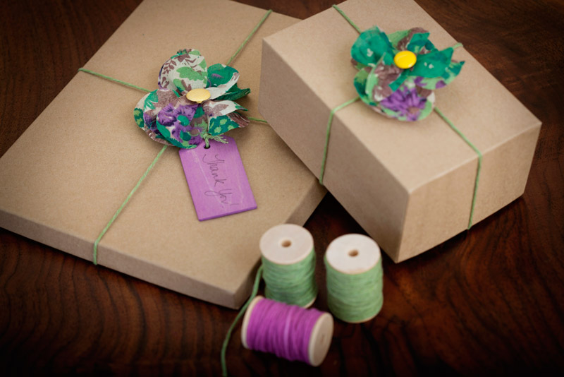
For some reason, I knew from the beginning of this process that I wanted to use fabric flowers to adorn my print packaging. I found a small piece of fabric with almost all of my colors at an independent store in Berkeley, and followed this tutorial on making fabric flowers from 100 Layer Cake. The only missing color in the fabric was yellow, but some bright yellow buttons solved that problem. Unfortunately, the fabric I have is not unlimited and so once I run out, I'll be on the hunt for different fabric. But that's OK, searching for salvaged fabric is part of the fun, and I like that my look can be eclectic and evolving. As an extra benefit, I glued on pin backings to the backs of the flowers so they can double as pins for sweaters, purses, hair pieces....

The photo boxes are probably the most boring part of my packaging. They're 100% recycled Kraft photo boxes from here. I scoured the internet for other interesting and *affordable* options, and to be honest, there's not really a whole lot out there! However, it's more important to have my photos arrive safely and in perfect condition than to arrive bent but in a pretty box. Hopefully with some creative accessorizing, I've spiced them up a bit.
To complete the look, I found beautiful natural wood hang tags that have each been stained by hand with an environmentally friendly wood stain and hand-dyed cotton from this amazing shop in Indiana called Olive Manna. I encourage all crafty brides to check out this shop as there are lots of ideas for DIY wedding pieces.


And that's it! The only thing I didn't show is my DVD packaging, which I didn't get around to creating and photographing yet so I'll have to save that for a later post. This is the last of my "identity" series. Like I've said, I had a really fun time working with Emma, who is just so creative, and I can't wait to put my new look to use for clients!
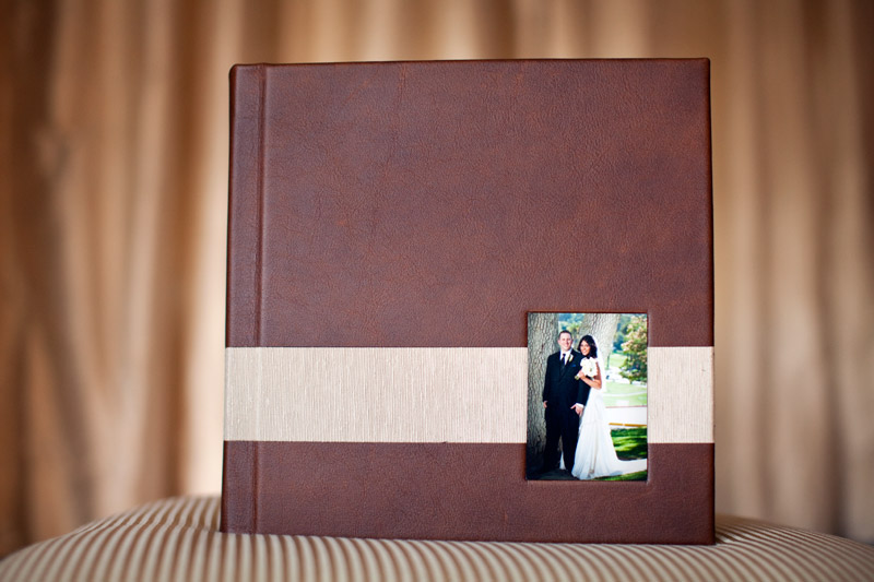 I'm adding a new album maker into the mix and am excited to show them off here! This is Jimmy and Reshma's wedding album, made by Leather Craftsmen. Now, you might be asking yourself why do I need yet another album option? Well, I love having options. My mom has always told me it's better to have options than to not. Each couple I work with is new and unique, and their wedding is a reflection of their personal styles - Dana and Marc went DIY and everything had a homemade, artisan feel whereas Marika and Felix created an intimate, romantic and sparkly night. Every wedding is a story that needs to be communicated in a different way, and the final piece that brings their story together, the album, needs to also be a perfect reflection of each couple's unique wedding story.
I'm always on the lookout for new ways to add to every couple's wedding - whether it's trying out different lighting techniques or finding new wedding vendors, searching for the perfect album for each couple is just part of the treasure hunt. Please let me know what you think about my latest addition!