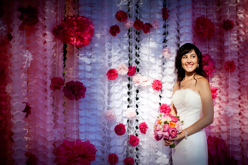
 Alisa and John's gorgeous DIY wedding is featured on Something Turquoise! I was so inspired by this wedding (and I'm not even engaged!) so go check out this post! Thanks so much to Jen at Something Turquoise for the beautiful feature.
Introducing: The High Five Factory
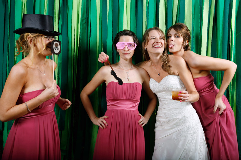
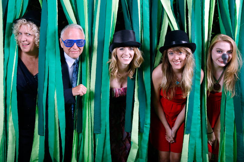
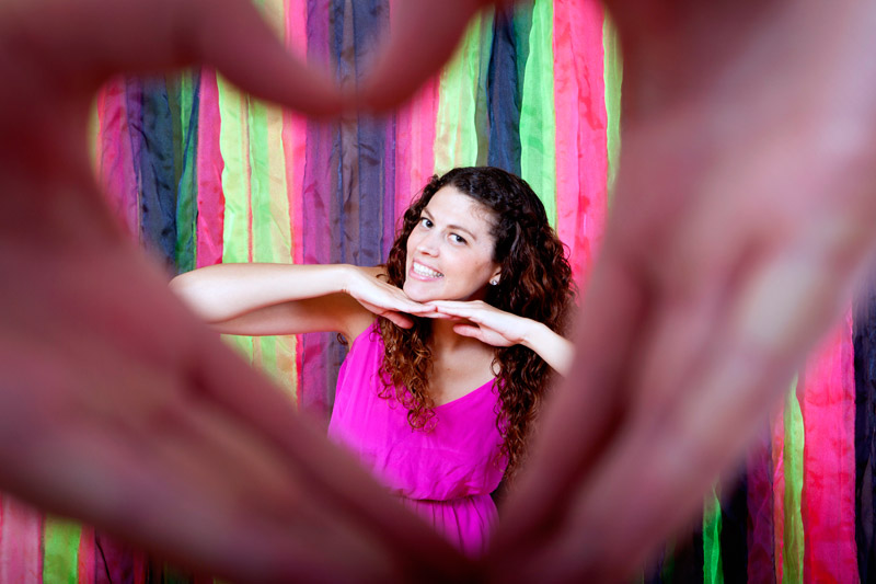 My friend April lives across the street, and she is by far one of the most creative people I know. I've solicited her help on quite a number of wedding related projects - most recently, she helped me make the backdrop and animal faces for Liz and Darren's photo booth (see below):


 So, check us out! You know you want to. : )
Liz + Darren's Photo Booth
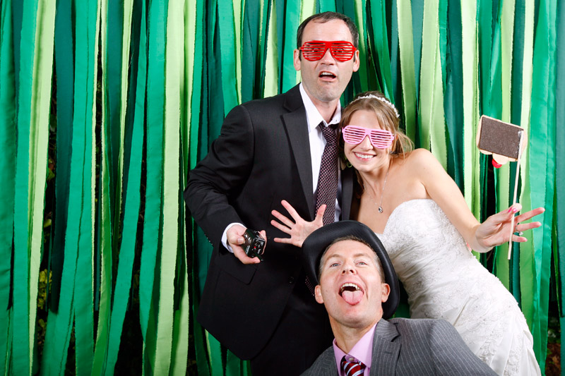 Over the weekend, we put up our first photo booth of the year for Liz and Darren's wedding in Capitola. We did some things differently for their photo booth, which I'll share in a later post, but for now, I wanted to post their movie. Make sure you watch through to the end so you don't miss Liz's sister Mary's solo dance show! The snippet of a song is "Dynamite" by Taio Cruz.

Creating an Identity, Part III
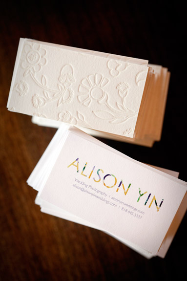
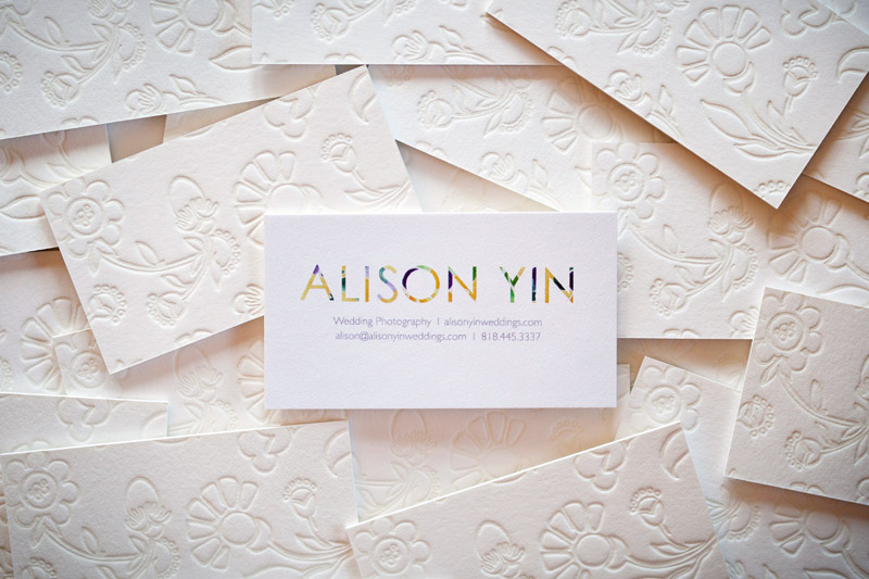 How many times do you receive business cards and put them in your pocket only to find them crumpled and completely chewed up in the washing machine? Well, that's happened to me so many times I've lost count. I am notorious for forgetting to empty my pockets before doing laundry. So, then, what's the point of spending money for nice business cards, you may ask? Well, I wondered that same thing, and here's what I've come up with: my goal of giving someone a business card is to leave an impression with them. I want them to remember that card that's in their pocket and go check out the information that's on the business card, i.e., pull up my web site next time they're on the computer. I'm not leaving stacks of cards at coffee shops hoping that random people will pick them up. I'm selectively giving cards out to prospective clients, other wedding vendors and hopefully wedding bloggers and editors. This means that I need my card to stand out, not only to encourage people to remember it and use it, but also because it's often other people's first impression of my style and aesthetic, and we all know how important first impressions are.
Therefore, Emma and I decided to make a card so thick there's no way someone will forget about it in their pocket. I also read that the more texture your card has, the more of an impression (literally and figuratively) it will make on someone just because they end up touching it more. So, here they are. They were created by Twig and Fig in Berkeley. The back of the card is letterpress with Emma's hand sketched floral illustration, and the front is flat color printed, all on recycled paper stock with soy based inks. Check 'em out:
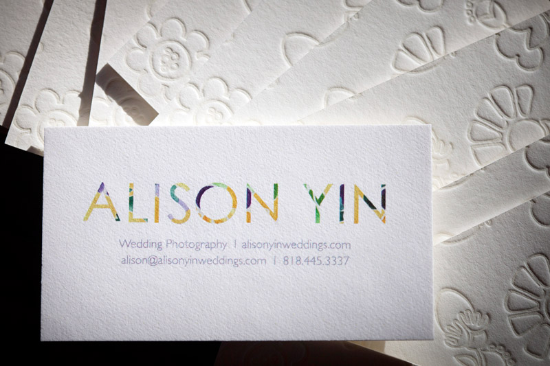

I know I went a little overboard with all the photos, but they are really beautiful, and since most of you can't see them in person, I figured I'd overload you with images. : )
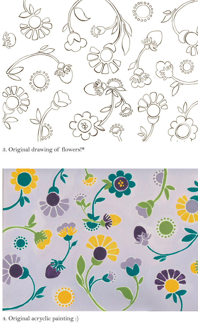
Stationery is up next. I send out handwritten cards to clients and other wedding vendors. Since Emma had created such lovely paintings - the purple one is acrylic and the yellow is watercolor, it was pretty easy to use both as the fronts of my cards. We used the purple painting for flat cards and the yellow painting for folded cards. The cards were printed by Brandes Printing Company, also in Berkeley, and also printed on all recycled paper stock with soy-based inks. I picked up the envelopes from Xpedex Paper Store in Berkeley, and again, they're 100% recycled - do you see a trend here?
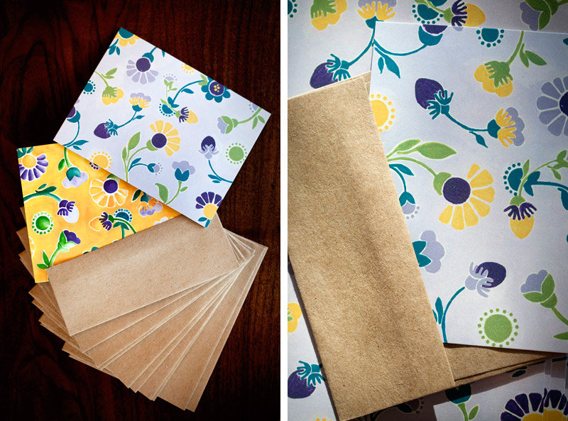

Here are the mailing labels that Emma designed. The smaller ones are for the stationery cards - they fold over so that my return address is on the back (Emma is so clever!), and the larger labels are for boxes that I send out. I actually printed these at home on sticker paper and then cut them out. Hooray for DIY!

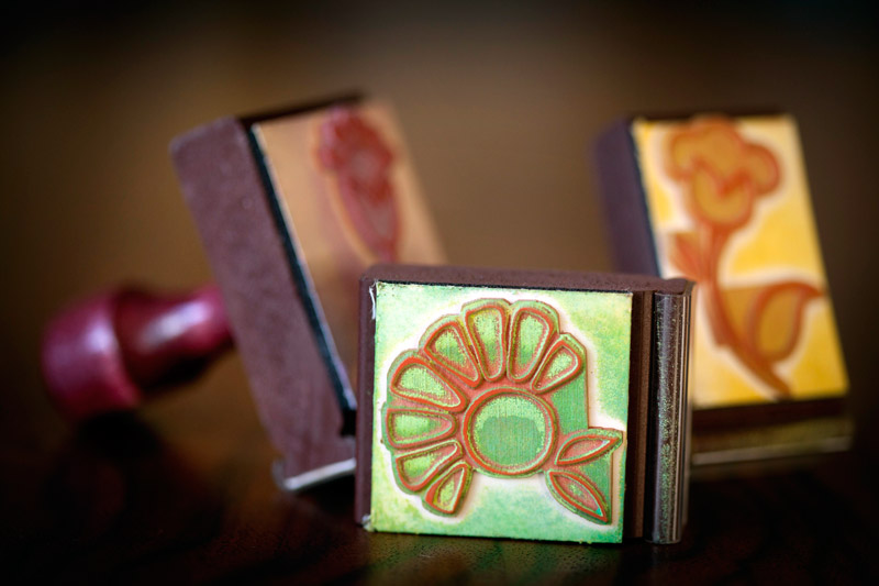
Emma made some stamps for me. You can never have too many stamps, right? I'll use them for all different things - envelopes, labels, boxes, hang tags... there are endless possibilities!
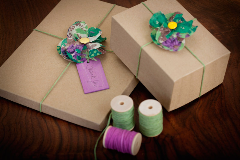
For some reason, I knew from the beginning of this process that I wanted to use fabric flowers to adorn my print packaging. I found a small piece of fabric with almost all of my colors at an independent store in Berkeley, and followed this tutorial on making fabric flowers from 100 Layer Cake. The only missing color in the fabric was yellow, but some bright yellow buttons solved that problem. Unfortunately, the fabric I have is not unlimited and so once I run out, I'll be on the hunt for different fabric. But that's OK, searching for salvaged fabric is part of the fun, and I like that my look can be eclectic and evolving. As an extra benefit, I glued on pin backings to the backs of the flowers so they can double as pins for sweaters, purses, hair pieces....

The photo boxes are probably the most boring part of my packaging. They're 100% recycled Kraft photo boxes from here. I scoured the internet for other interesting and *affordable* options, and to be honest, there's not really a whole lot out there! However, it's more important to have my photos arrive safely and in perfect condition than to arrive bent but in a pretty box. Hopefully with some creative accessorizing, I've spiced them up a bit.
To complete the look, I found beautiful natural wood hang tags that have each been stained by hand with an environmentally friendly wood stain and hand-dyed cotton from this amazing shop in Indiana called Olive Manna. I encourage all crafty brides to check out this shop as there are lots of ideas for DIY wedding pieces.


And that's it! The only thing I didn't show is my DVD packaging, which I didn't get around to creating and photographing yet so I'll have to save that for a later post. This is the last of my "identity" series. Like I've said, I had a really fun time working with Emma, who is just so creative, and I can't wait to put my new look to use for clients!
Creating an Identity, Part II
When I was four years old, my mom let me pick out my own shoes. Well, sort of. She would take me to Nordstroms and pick out three pairs of shoes that fit her criteria - durability, budget and style, and then she let me determine which of those three shoes I wanted. At the time, with the power to make the final decision in my hands, this made me feel like I was in charge. However, in looking back, I of course now realize that it was still my mom who was running the ship. When I made the decision to work with Emma on my (re-)branding, I felt this huge weight lifted off my shoulders. I was finally leaving it to the professional, one whom I trusted and had great confidence in, to create the perfect logo. Little did I know that Emma would put me right back where I was when I was four: she'd give me choices, all ones she knew she could stand behind, and leave the final decision up to me. Lucky for me, I was in capable hands with Emma, just as capable as my mom who covertly stylized my feet for the duration of my childhood. The first step that Emma and I worked on for creating a logo was coming up with a color scheme. She initially gave me four options, as shown below:

My favorites from the initial selection were the second and fourth choices. I loved the second choice because the colors had been pulled from a floral arrangement that had two of my most favorite plants: succulents and rhonunculas. I also loved the last palette - something about it felt very French and rich to me. We further explored these choices:

And, after a little tweaking, we landed on the color scheme below:

Once we had determined the color scheme, Emma sent me some font options:

I narrowed them down to 3, 5, and 6. Even though they're the plainest of the bunch, the simplicity of these fonts felt very Marc-Jacobesque, who was one of my main inspirations for a clean and no frills logo.


Next, Emma presented her first stab at the logo!

And, here are some ways that it could be implemented into marketing collateral:

When I first saw the logo, I immediately loved the painted flowers. I loved the whimsical feel of them, and I thought the colors integrated really well together. I wasn't too crazy about the heart, which felt big and bulky to me, and left no space for the typography.
 So, Emma played around with the painting and font and came up with this:

I loved this idea - at first glance, you can't tell what the design within the text is, but it's bright and colorful. I can easily integrate the flowers into other aspects of my collateral so that the whole presentation holds together. I didn't want all of my pieces to be matchy matchy, but instead wanted them to feel a little eclectic. However, in this first round, there was a little too much purple within the name, so Ms. Emma went back to the drawing board and came up with this:

The yellow background did it for me, and voila, we had a logo!

Not to toot my own horn, but I love how the logo incorporates BOTH elegance and simplicity with a sense of fun and beauty, all elements that I want people to think of when they see our clients' wedding photographs. In my next post, I'll be revealing all of the final pieces of collateral including business cards, stationery, packaging...
Jaime + Bryan in Oakland, CA
 Jaime and Bryan had a really lovely wedding right here in Oakland at the Montclair Women's Art Club. They had lots of beautiful details including a paper flower wall, succulents in the flowers, and postcards of their favorite movies for table place cards. The Montclair Women's Art Club was also fun to make photos in - Adm especially enjoyed the bar area which had some fun murals on the walls. All around, good people and a beautiful event.
Following two photos are by Adm:
Photo below by Adm:
Three photos below by Adm:
Adm set up and made this photo below at the Montclair public library across the street:
Photo below by Adm:
Adm lit this photo below, which I shot:
