For this week, I'm going to blog about the process of creating an identity. I found the process fascinating and fun, and so hopefully it will help some of you all out there who are thinking about or getting ready to embark on this same journey. When Adm and I first started the wedding business, we pretty much started from bare bones. As in, we didn't have any kind of budget for marketing, advertising or branding, and to be honest, I don't think we really knew that that was a key part of starting and running a business. We knew we needed a web site and business cards, but we didn't know what "creating an identity" meant or that it was a necessary part of building our business. Both of us are fairly creative people, and that was what we had focused on honing, not our business and marketing skills. Since we had to create everything on the cheap, I did it all on my own.
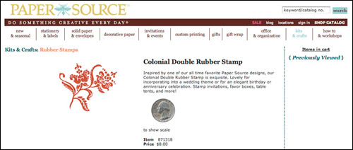
I found a floral stamp at The Paper Source for $8, photographed it, and bam, put some pretty font next to it and that was my logo. I put that stamp to good use and stamped floral patterns all over everything - stationery, envelopes, contracts, shipping labels.... I have to admit, I was pretty proud of myself for coming up with a design that had a somewhat DIY/custom feel and fit within our non-budget. I picked the brown and blue color scheme because blue was for Carolina blue (my alma mater), and I liked how brown complemented the blue.


At some point, I think around the beginning of 2010, Adm and I decided that we were ready to create a legitimate logo and identity that was a reflection of what we and our photography are about. We also decided that it was time to hire a professional to do this. This was kind of huge for us because it marked the first time that we were hiring other people to do work for the business. Up until this point, we had done everything ourselves, but we also realized our limitations, particularly the fact that we're not designers. We brainstormed moods, themes and adjectives that we wanted our logo to reflect - emotions that we wanted people to feel (either consciously or subconsciously) when they looked at our logo and our photographs. We did all kinds of exercises, like coming up with single sentences to describe our approach, creating a mission statement, outlining our long-term and short-term goals... Initially, I thought these exercises were kind of silly and a waste of time, but they're really not. They forced us to be able to articulate what we are about, our vision and what we want our clients' experience with Alison Yin Weddings to be. While we were doing this, I kept pulling design inspiration from the web and just putting all of that away in a folder for later use.
The next task (no small feat) was to find the right designer. We did have some restrictions - namely, our budget, and we wanted to work with someone local so we could be active and in-person participants. That, and we're also trying to support local businesses and services as much as possible. In researching graphic designers, I noticed there are lots of different types of designers - the three most obvious to me were designers who specialize in typography, others who specialize in collage and mixed media, and others who are illustrators. We wanted someone who could draw so we went the illustrator route. I realize that all of this must sound really elementary, but figuring out these basic principles literally took us months, so that just shows where we were coming from.
After several meetings with designers and countless hours looking through online portfolios, we finally stumbled upon Emma Robertson. At the time, Emma had just moved to Berkeley from Paris, one place that provided some major inspiration for the look I wanted to create. What sold me on Emma before even meeting with her was the personal work portion of her portfolio and her blog. Most of the time, graphic designers create work that reflect the vision of the people they're working for, so it's not really a true reflection of what their personal style is all about. I love Emma's illustrations and her use of color, AND her blog is full of things she likes and is drawn to - all things that were on the same wavelength as what I wanted.
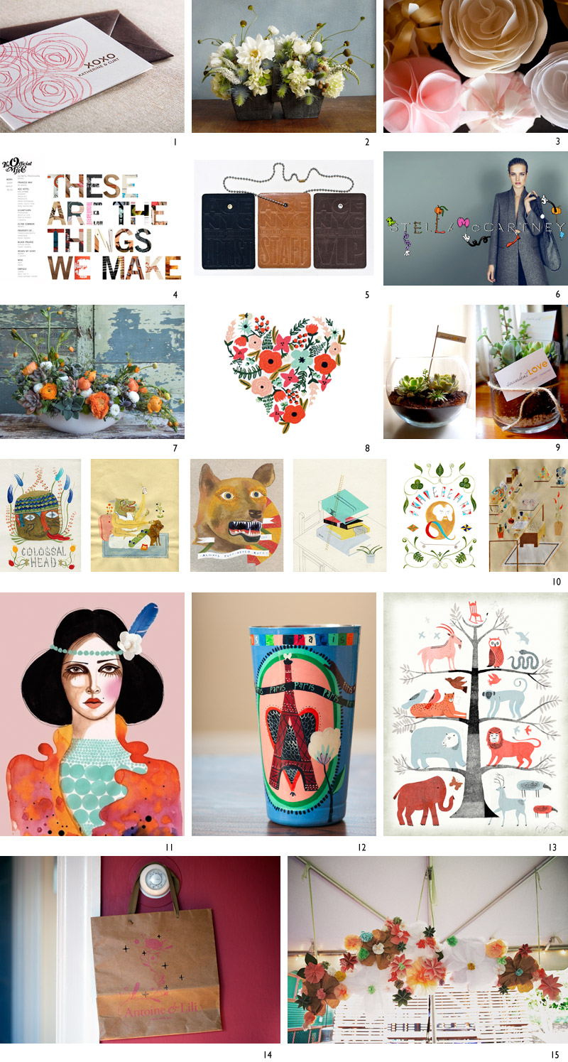
Unfortunately for Emma, I basically just dropped my inspiration folder in her lap (there were at least 85 different photos of things), and told her to have at it. Here's a sampling of what I gave her:


Below is a smattering of things that I like that I gave Emma. I wanted her to create something that was pretty and elegant, but that also had a hand painted, whimsical and quirky feel with room to evolve over time. And obviously, as you can tell from just glancing at the images below, I love color so that was also key.
11/12 (a vase I brought back from Paris)/13
14 (a bag I brought back from a store in Paris)/15
For the next blog post, I'll write about the process of working with Emma and coming up with our new look.

