When I was four years old, my mom let me pick out my own shoes. Well, sort of. She would take me to Nordstroms and pick out three pairs of shoes that fit her criteria - durability, budget and style, and then she let me determine which of those three shoes I wanted. At the time, with the power to make the final decision in my hands, this made me feel like I was in charge. However, in looking back, I of course now realize that it was still my mom who was running the ship. When I made the decision to work with Emma on my (re-)branding, I felt this huge weight lifted off my shoulders. I was finally leaving it to the professional, one whom I trusted and had great confidence in, to create the perfect logo. Little did I know that Emma would put me right back where I was when I was four: she'd give me choices, all ones she knew she could stand behind, and leave the final decision up to me. Lucky for me, I was in capable hands with Emma, just as capable as my mom who covertly stylized my feet for the duration of my childhood. The first step that Emma and I worked on for creating a logo was coming up with a color scheme. She initially gave me four options, as shown below:

My favorites from the initial selection were the second and fourth choices. I loved the second choice because the colors had been pulled from a floral arrangement that had two of my most favorite plants: succulents and rhonunculas. I also loved the last palette - something about it felt very French and rich to me. We further explored these choices:

And, after a little tweaking, we landed on the color scheme below:

Once we had determined the color scheme, Emma sent me some font options:

I narrowed them down to 3, 5, and 6. Even though they're the plainest of the bunch, the simplicity of these fonts felt very Marc-Jacobesque, who was one of my main inspirations for a clean and no frills logo.


Next, Emma presented her first stab at the logo!

And, here are some ways that it could be implemented into marketing collateral:

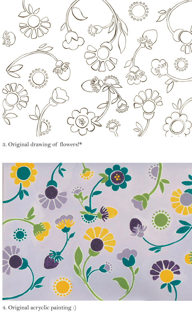
When I first saw the logo, I immediately loved the painted flowers. I loved the whimsical feel of them, and I thought the colors integrated really well together. I wasn't too crazy about the heart, which felt big and bulky to me, and left no space for the typography.
 So, Emma played around with the painting and font and came up with this:

I loved this idea - at first glance, you can't tell what the design within the text is, but it's bright and colorful. I can easily integrate the flowers into other aspects of my collateral so that the whole presentation holds together. I didn't want all of my pieces to be matchy matchy, but instead wanted them to feel a little eclectic. However, in this first round, there was a little too much purple within the name, so Ms. Emma went back to the drawing board and came up with this:

The yellow background did it for me, and voila, we had a logo!

Not to toot my own horn, but I love how the logo incorporates BOTH elegance and simplicity with a sense of fun and beauty, all elements that I want people to think of when they see our clients' wedding photographs. In my next post, I'll be revealing all of the final pieces of collateral including business cards, stationery, packaging...
